When good covers go bad

There's an interesting little story in the New York Times today about Rick Moody's new novel The Diviners. It should be an object lesson to anyone who is involved with publishing books, but alas, it probably won't be. Moody's book is a literary satire about Hollywood, but the cover looks like a bad fanstasy POD with a Conan-like Viking dude standing on a rock branishing a stick. The Diviners had a huge pre-pub buzz going -- until it was unveiled at BEA. That's when its publisher, Little Brown, realized that the cover was turning folks off. "I saw a lot of people, particularly women [Moody's main readers, the article says], just turn away from the cover," said Michael Pietsch, LB's publisher. "I realized we were making a mistake...we loved it, and the author loved it, too. But it was not communicating the information we wanted about the book."
Well...duh.
So LB went back and retooled. The final product is only marginally better, in my humble opinion. But what is most interesting was the line further down in the story: "Covers are occasionally changed based on the response to early copies, but not often. In an industry where publishers are the first to admit that they can rarely tell in advance whether a book will become a best seller, market research seldom extends beyond such seat-of-the-pants inquiries."
To which I can only ask: Why the hell not?
Conventional wisdom says that the two main things that sell books, especially if the author isn't a megastar, are word of mouth and a great cover.. Publishers have no control over the first. But they have all the control in the world over a cover -- and how well it conveys the tone and intent of the author's vision. Be it high-faluting literature or lowest-brow genre, you can judge a book by its cover -- or you should be able to.
So why don't publishers test market covers, say, like movie studios test endings or promotional posters? I'll let M.J. Rose speak to this point, as she did recently on her blog Buzz, Balls & Hype:
"Why don't publishers find out what readers think about covers before they settle on them? It's readers who ultimately are the ones who are either going to pick up the book or not. Not other publishers. Not booksellers. Not editors. Not art directors.
"When I self published my first novel, I had five covers done, went to the mall in Stanford, CT., stood outside of Victoria's Secret and over the course of an afternoon ran an impromptu focus group with a few dozen women. One cover won hands down. It would cost a publisher about $1500 to run a test like that. Or even less if to do it on line.
"At least by doing this, we'd have practical information to go by. Or is it really better to have in-house publishing folks who see hundreds of covers each month continue making subjective decisions? Or asking bookbuyers who are equally overexposed to make all the decisions? Why is our industry leaving so much to chance? Why do we continue to rely on all the same old ways of doing things? With over 1000 novels showing up on the bookshelves every single month why are we still making decisions based on little else but gut instinct. Book sales being what they are, isn't it time to get gutsy and try some new methods of making decisions?
Good questions.
We've been very lucky with my covers so far. Our pub, Kensington has worked hard to make them reflect our themes and has even been great in asking for our input (we don't have cover consultation in our contract; few authors do.)

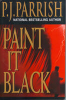
 And since our stuff is PBO, there isn't a lot of room for error on our covers. I think one reason our third book, "Paint It Black" made it onto the New York Times bestseller list was its striking red and black cover. I think the big reason our followup book, "Thicker Than Water" didn't was because the cover was too dark and got lost on the shelves.
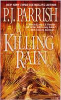
When Kensington was readying our latest book, "A Killing Rain," they showed us the cover ahead of time.
 It was very striking -- a gold imbossed sea of sawgrass blades cut with the prow of a boat. We loved it, except for one thing: There was a dead man's hand laying in the boat. We had no dead men in our story. We had no boats in our story. But the cover was so damn good, we forged a compromise. We rewrote a murder scene to include a boat and Kensington went back and made the hand look feminine.
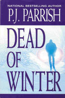
But I think my favorite cover was for our second book "Dead of Winter." I liked it because its single image of a guy
 caught in the snowy glare of headlights was clean, evocative and immediately telegraphed all you needed to know about the book's tone and setting. I can't tell you how many fan letters we've gotten that begin, "I never heard of you before but I picked up your book because the cover looked interesting..."
So you tell me? Why the heck don't publishers test market? They routinely send proposals, manuscripts and covers to their sales departments for input. They have even been known to consult with the lone buyer for Costco, Pennie Ianniciello , who is solely responsible for chosing which books make it into all the Costco stores. When Simon and Schuster was planning a series of William-Sonoma cookbooks, they showed the covers to Ianniciello, who told them they were too dark and wouldn't stand out on the shelves. S&S changed them.
Shoot, I wish I could have gotten Pennie to sign off on "Thicker Than Water!"
p.s. For a look at some really nifty covers, go to this website


1 Comments:
I suspect it begs the questions--why don't publishers run themselves like businesses? Despite the questionable trend of choosing books based entirely on the say-so of the marketing department, the Run The Business Based On Heresy And Gut Feelings Style of Management can be a bit unnerving.
On the other hand, the movie industry focus groups things to death, and they're not exactly churning out a plethora (always wanted to use that word on a blog) of amazing, scintillating movies, are they? I suspect covers are great for making people pick up the book--assuming they see the damned thing, since not that many books are cover-out--but have little affect on previous readers. Maybe it's the photos of the author... or the blurbs ... or the type font ... or Oprah's hairdresser's cousin's sister's astrologist's recommendations...
Best,
Mark Terry
Post a Comment
<< Home